CHALLENGES, WHAT ARE THEY GOOD FOR?
( Paintings can be seen on my Facebook page, Diane R Mannion)
The Strada Easel 31 Day Painting From Life Challenge, 1/2019
I’ve done several 30 Paintings in 30 Days Challenges in the past and something good always happened. This time, the benefits were well worth the struggle!
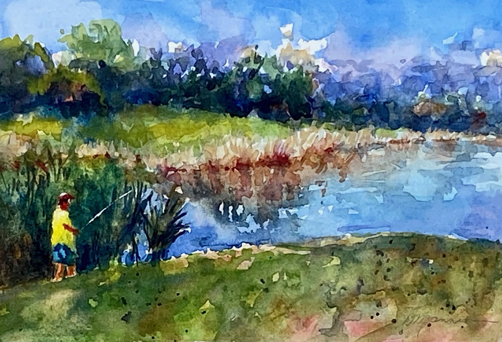
Painting from life took a lot of effort, focus, and not a little stress. Previous challenges with other groups didn’t have that rule. It’s easy enough (at least for some of us) to create a painting from reference photos rather than jumping in the car in search of a landscape, setting up a still life, or finding a model.
I have nothing against using photo reference that I take myself and indeed, use it often in studio work. The great difference realized during this challenge was the feeling of authenticity and sincerity that a painting can have when also created from life.
A photo or computer image is vastly different than the actual scene. It lacks the color, the sense of space, and especially the values of the subject. Photography, along with quick sketches, painted from life to record color notes, actual light/dark relationships, and a vital sense of place will be the main way I compose studio paintings from now on.
It was comforting knowing other artists were going through the same experience at the same time. Viewing work online from across the country and around the world gave the experience a great sense of artistic camaraderie. I’m happy that a couple of my “real life” friends decided to join in. They learned the value of how daily practice helped their work, and that sketching and painting faster made their work stronger and more confident. One friend has decided to keep going after 31 and make it 100 days. And in a few months, we may create our own challenge, maybe 100 faces or figures or flowers…
The most difficult painting of this challenge was my self-portrait! I had my head turned (to my good side) and also had to wear reading glasses to draw. The next self-portrait will have me looking straight at the mirror, instead of turning to look. I lied a lot and left out a few wrinkles.
The scariest painting was when I decided to pull into a local nature preserve. It was a spur of the moment thing, so I didn’t invite a painting buddy. Set up under the hatchback and realized it was too lonely. Not a soul around. Signs read, this area is under video surveillance, if you see something, say something. Creepy! Painted fast and got the heck out of there! The sketch turned out pretty good though, must have been my nervous fingers.
Every painting has a story, especially this cold-for-Florida January. Painted on the beach several times with my painting buddy. Wonderful, not a tourist in sight! Painted with the Peace River Painters one morning that promised sunshine but the forecast was completely wrong. Cold, damp, and windy, instead. How we suffered for our art! My worst sketch of the month!
Painted during a Quick Paint and won enough prize money to keep me in paint for the next few months.
Somedays, I painted two or three to keep the pressure off. Sometimes, the more you have to do, the more you get done. And self-discipline is everything! Thanks to Strada Easel for reminding me. That’s what challenges are good for.
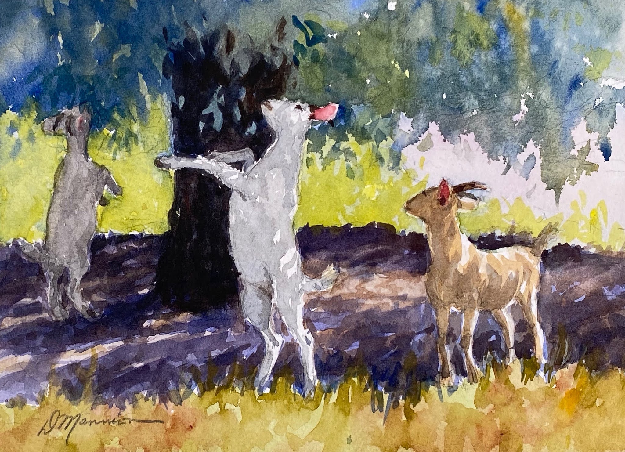
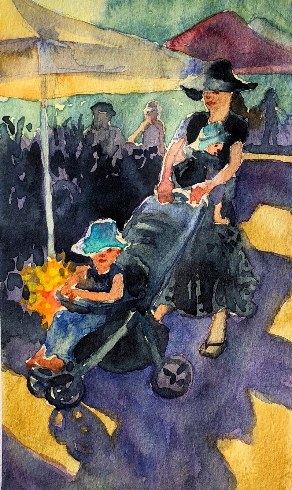
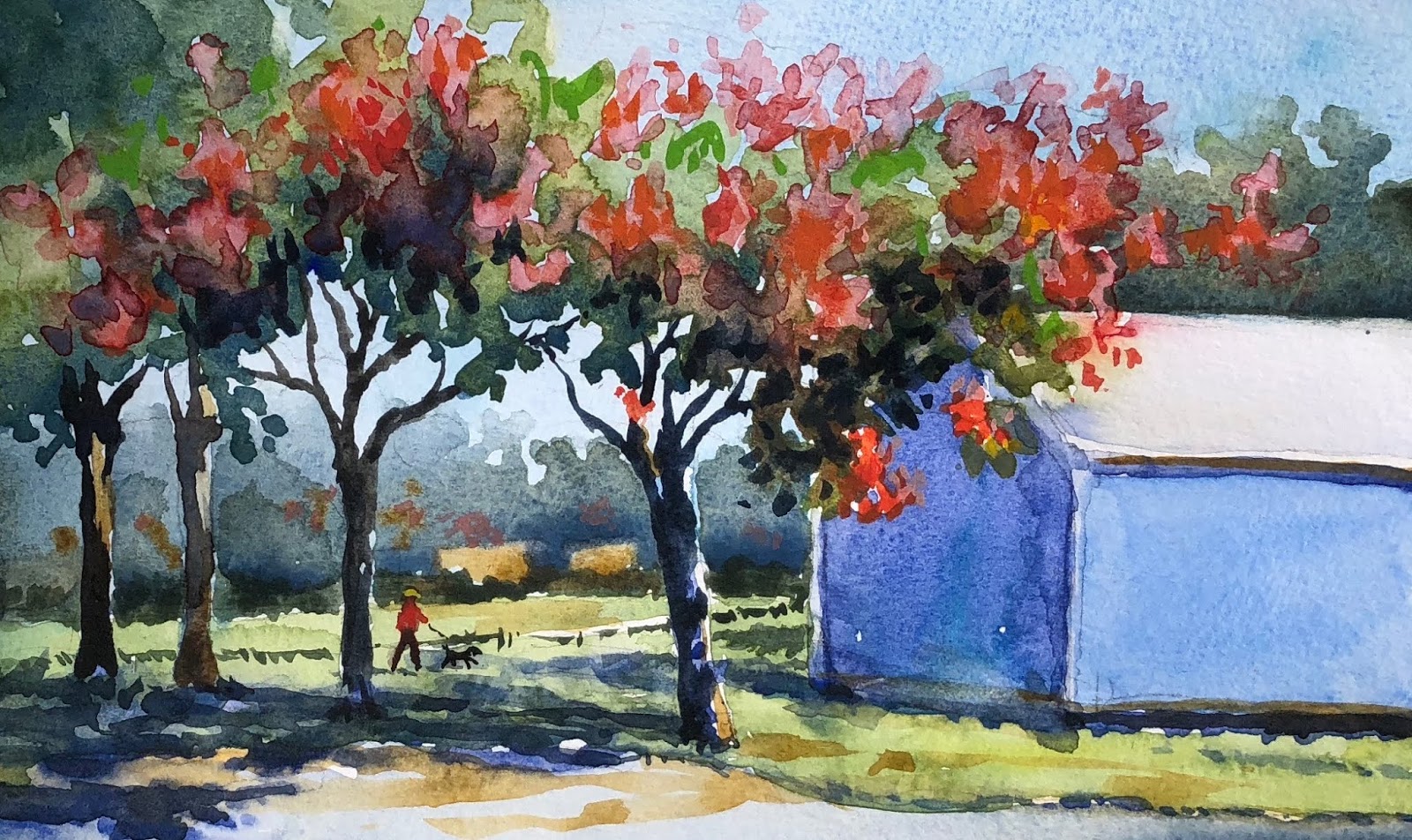
What January Looked Like!