Thursday, June 29, 2017

This Morning

THIS MORNING, 6.5x8.5"pastel, Diane Mannion

Field Study to Studio Sketch

Sketched on the boardwalk of a local beach this morning with two other artists.  This spot is less than ten minutes from my house if I hit the lights right!  Lucky me!
After scribbling a thumbnail sketch in my Moleskine notebook, I worked on Canson Mi Teintes using a limited supply of hard pastels, washed with alcohol, then fiddled until the paper couldn't hold anymore pastel layers.  

Later, this field study was useful for the studio sketch above, This Morning.  A location snapshot helped but mainly working with the colors fresh in my mind's eye helped a lot.

For This Morning… I used Pastelmat and a larger selection of pastels.  Giraults, Rembrants, Polychromos, and Great American and Sennelier for the final highlights on the sea oats.
Location shot… Englewood Beach view from boardwalk.

Tuesday, June 27, 2017

Lacy Mangroves

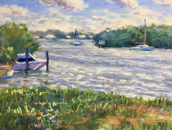
Lacy Mangroves, 6.5x8.5"pastel, Diane Mannion

DUSTY

Lacy Mangroves is based on a field study from my last post, Shady View.  Tried to visualize and remember the original reason for sketching this scene in the first place… loved the Gulf water sparkling through lacy mangrove trees.  
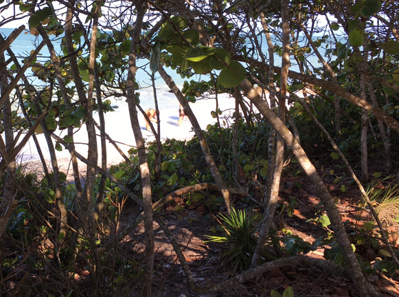
Shady View, 6.5x8.5" pastel, field study, Diane Mannion

My first attempt at doing a study from this plein air sketch was a disaster!  I kept notes on my struggle to share the misery.  My emotions went from "Why am I torturing myself with pastels?  To… "There's something wonderful about this stuff!"
The I HATE IT! stage.  Darks too dark.  Did not capture the "mood" I wanted.
Didn't want to rip it up because it was on Pastelmat… not to waste!  Had smashed tons of pastels on it.
Went outside and brushed it over a sheet of copy paper.  Then tipped the pastel dust into my Dust Collector Jar.  Saved almost enough to make another stick which I will eventually do when I have collected enough hate-it-stage dust!  Just add purified water and mix, shape, let dry and presto… a new stick.  Sprayed the drawing with Workable Fixative for extra tooth and workability.
Liked the way it looked as an underpainting, had an ethereal quality.
Began putting colors on in straight, diagonal patterns.  Some artists like working this way but after a while, I lost patience and had to resort to my speedier, scribble technique.
Here's the finish again… MUCH happier with it.  There's something wonderful about pastels!
Yesterday I hated them… today it's love.
And I didn't waste that sheet of Pastelmat!
***Pastels used: Nupastel, Girault, Rembrant, Sennelier, Great American
      Paper:  Pastelmat by Clairefontaine, 7x9.5" white pad with glassine between pages, great for travel!
Book reference:  PASTEL POINTERS, Richard McKinley… classic!  Has instructions for making pastel sticks from dust and scraps.

Friday, June 23, 2017

Shady View


Shady View, 6x9" pastel, plein air sketch, Diane Mannion

Color Notes

Delightful morning sketching with my BPB (Best Painting Buddy)!  We've painted together since 2008, have always learned from each other and shared art supply tips.  We have the same interests in materials and methods of painting.  I'm blessed knowing this inspiring artist!

We found a shady spot overlooking the beach which also had a picnic table, handy for comparing pastel sticks.  This is what obsession looks like:

My quick Moleskine ink thumbnail sketch:
Pastel sketch, again… Shady View.
View from the shade.  Again, the camera cannot "see" the colors that are really there.  
These field studies are so important for collecting color notes. 

Worked on Pastelmat using Nupastels, Rembrants, and Giraults.  Experimented with small selection of pastels in a tiny plastic box which I hope will work for traveling this summer.  Alcohol wash after roughed in local color.  Only blended with pastels, no fingers or tools.  Sketch is still in "raw" state, as it was when I left the beach.  But as my BPB said, "Leave it alone… just do another."
My handy 3.5x7" travel pastel box arranged light, medium, darks, and pastel pencil.  Found box in fishing department for about $3.00.  Just something to pop in my bag and go…  

Reminder:  Go to beach more!

Thursday, June 22, 2017

Chadwick View

Chadwick View, 6x9" pastel, plein air, Diane Mannion

Cool Breeze

A few artists braved the heat this morning at Chadwick Park in Englewood.  There was a lovely, cool breeze under the shade pavilion where three of us worked in pastels.

Practiced sketching with a small selection of pastels instead of hauling out hundreds.  Pastels seem much more difficult than working in oils where I only need red, yellow, and blue plus white.  But I'm determined to get the hang of it.  It's much easier when I allow myself to simply sketch and take notes instead of creating a "finished masterpiece."

Worked on Pastelmat… love it!  Used an alcohol wash over roughed in sketch, then layered and layered.  Pastelmat takes a lot!  Blended with Nupastels over Rembrants and Giraults.  Polished a bit later and darkened the foreground.  

Started with a thumbnail sketch in my trusty Moleskine.

Beautiful sky this morning, the photo does not show it!  This is why we paint outside!  The colors and sense of place cannot be captured with a snapshot.


Friday, June 16, 2017

Boca Cottage

Boca Cottage, 8x10" oil, Diane Mannion

Boca Grande Morning

While I was painting, a man rode by on a golf cart and said, "Great light this morning!"  And it was.

This was a "test drive" for new tripod and set of Rosemary plein air brushes, both were excellent.  Unfortunately, I had left a few major tubes of paint back home and had to wing it with color.  

Instead of ultramarine blue, I had picked purple, and instead of cerulean… phthalo blue!  But it was interesting to see how purple and phthalo mixed was almost like ultramarine.  Wanted to work with a limited palette anyway.  And did not use any earth colors (a friend of mine will be happy to hear).
Used water mixable oils, this is the underpainting.
The "raw" stage as it was before taking it back to the studio.  
And well noodled finish using the "missing" colors.

Thursday, June 15, 2017

Sea Tickle

Sea Tickle, 55x8" pastel, Diane Mannion

LET IT GO!

Sometimes, it's not easy.  Some of my recent pastels have worked out smoothly without many corrections... Fish for Supper, the last post was one.  Pastels take the image in unexpected directions, Sea Tickle as it is, is not where I wanted it to go and I'm not happy with where it went.  Darn pastels!

Biggest problem I had was not having the right color and value for water, a silvery blue gray.  Had to do a lot of mixing, then overworked.  

Simply had to stop after so many brush offs and restarts.  Got to the point where I hated it, then liked it and then hated it again.  A lot of paintings go through an UGLY stage and then can be "finished" at a more acceptable stage, this one barely made it.  It's not my best.  Only posting it to share the struggle and perhaps help someone else going through the same thing feel better. 

Not every painting or drawing will make it into the Met... so just have fun, lighten up, and LET IT GO!  

Progression of suffering:
Scribble in Moleskine of figure
Had most fun at this stage!  And like it the  most!  Simple water wash of roughed in pastel that I let drip on Uart 400 taped on four sides.  Let dry in the sun and buckles flattened out.
One of the layers on top of the water wash, brushed off in frustration.  But still like this more than the finish (or the stage that I gave up on).
The stage I gave up on!  Must have learned something from this?
It's just practice for the next one.  Instead of reworking this one, I should start over.  I like the water in the above stage better.  Let it go....


Tuesday, June 13, 2017

Fish for Supper

Fish for Supper, 5.5x8" pastel, Diane Mannion

Painting's Like Fishing

Often I struggle with a piece, fought this one for an afternoon, had an idea on the line and hauled it in.  Painting's like fishing, every once in awhile, I catch a good one.  

Pushing technique and color, breaking away from photo reference and using more visual memory is a challenge.  Everything in this little pastel sketch is made up from bits and pieces, mostly memory.  It was difficult molding these into the image in my mind's eye… but feel I'm getting close.  

Pastels are helping me "see" a new direction for my oil painting.  I could have done these studies in oil but pastels are quicker.  Pastel colors are incredibly gorgeous and will influence how I mix color in oils. 

The "underpainting" using purples and oranges on Uart 400, alcohol wash:

Saturday, June 10, 2017

Water Works

Water Works, 5.5x8" pastel, Diane Mannion

Studio Study

Hoping these water studies will help when I get back out in the field.  Still stuck in the studio (my favorite place, anyway) but developing a bit of house-itis.  Still healing from surgery, still can't drive but should be able to in a week or so, then at least I'll be able to sketch from the car.  Unusual stormy spell here in SW Florida, not used to so many gray days all in a row.  I thrive on sunshine and shadows!

Fascinated with water and rock patterns and love that I can move them around to help composition… not a slave to the photo!  Also working from visual memory, there are purples, oranges, and blues that don't show up in the photo.  Intensified color for dramatic effect using my artistic license!

Worked on Uart 400 with alcohol wash underpainting.  Assorted pastels… Girault, NuPastel, Rembrant, Sennelier, Great American.  Blended with hard pastels, no fingers!


Thursday, June 8, 2017

Gator Pond

Gator Pond, 5.5x8" pastel, Diane Mannion

GATOR POND 

Sometimes I ask myself… why struggle with this medium when I'm perfectly happy with oils?   Then every once in awhile a pastel turns out pretty well almost by accident.  Maybe it's the vivid colors, or the different way of applying the material, by hand instead of a brush.  Whatever…  this love/hate thing with pastels has got me hooked.  My goal is to use these pastel studies as reference for oils.  One medium DOES inform the other.

It's frustrating while searching for the perfect color pastel stick when I know I can mix the exact color I need in a second with my limited palette of oils…red, yellow, blue, and white!  Then sometimes, because I can't find the perfect color, another color pastel stick works out in an unexpected way.  Like a game of chance, by not being able to control the colors like I'm accustomed to in oils, new creative directions happen.  Sometimes… 

Gator Pond was a struggle!  Blended, brushed, wiped, sprayed with fixative, brushed with alcohol, and almost tossed it out.  Worked from photo reference again, a scene I shot at the Punta Gorda Environmental Center, major alligator habitat!  Loved the cloud reflections in the water.  Still stormy weather here and recovering from surgery (healing fast, thanks!) so I couldn't work outside.  Another studio study.  What did I learn from this one?  Don't give up. Patience!  Persistence!
Underpainting of local colors blended with alcohol.
Worked on Uart 400 sanded paper with assorted pastels, hard and soft.  
Should have stopped here! 

Tuesday, June 6, 2017

Caspersen Rocks Study

Caspersen Rocks Study, 5.5x8" pastel, Diane Mannion

Pastels Rock!

Stormy day here, perfect for studio pastel study.  Worked from digital photo reference, but a lot's from visual memory.  Changed the rocks around to form a pattern I liked, was not a slave to the photo. 
The photo colors simply don't show up as I remember them while painting on this location, which I do often (one of my favorite spots).  And every time I glance at the eye candy in my pastel box I want to add more colors just for fun! 

Pastels allow me to SEE colors I never would have thought to mix if I had been working with oils. Used assorted pastels, Rembrant, Girault, Sennelier, Great American, and NuPastels on UArt 400 sanded paper, one of my favorites along with Pastelmat and Canson Mi Teintes smooth side.

It's magical painting on this beach early in the morning when the shadows are long and the sun hits the algae covered rocks.  Usually only a few fishermen around, too early for most tourists except for beach walkers.  It's only towards noon that blankets go down,  umbrellas set up, and the shark's tooth hunters arrive with their gear, wading along with the shore birds or snorkeling outside the rocks.

Rocks aren't a natural site along Gulf Coast beaches, they were planted years ago as a way to prevent erosion… doesn't really work. 

Here's a shot of my favorite painting spot!  Venice, Florida on the Gulf of Mexico early morning.

Sunday, June 4, 2017

Market Boy


Market Boy, 5.5x8" pastel, Diane Mannion

Farmer's Market Find

Love roaming around the Farmer's Market snapping away on my iPhone, never know what will show up later.  This little guy was walking past the plant booth and appeared on the edge of a photo I shot of something else.  Loved how the light spilled across the plants onto his head and red shoes.  

Although I had promised to set up my plein air gear that morning, there was no way I could have captured him while painting from life.  Sometimes, photo reference comes in handy.

I'm healing well from surgery, ready to toss the cane… can't wait to get out there again!  Meanwhile, having fun playing in the studio.  This one was a mixture of pastel brands on Canson Mi Teintes ochre colored paper.  Here's an underpainting stage while it was still taped to the board.  

Saturday, June 3, 2017

Caspersen Path

Caspersen Path, 5.5x8" pastel, plein air, Diane Mannion

Plein Air Pastel

Went through a stack of pastels I did awhile ago, destroyed a few, and some popped out that I didn't like at the time but do now,  especially this one! 

Scribbled on location one sunny morning.  Mostly NuPastels on Canson Mi Teintes ochre colored paper.  Magic happens when painting or drawing from life.  It's a challenge locking in rapidly moving shadows and flashes of sunlit leaves, but this gives the drawing life and spontaneity.  

Every drawing is practice for the next one or the next painting.  If a violinist had to save every practice session, they would be stacked up like mine.  And once in awhile, it helps to look back, purge the bad ones and keep the good.

CASPERSEN PATH, DAILY PAINTWORKS PICK OF THE DAY! 

Friday, June 2, 2017

Beach Again

Beach Again, 5.5 x 8" pastel, Diane Mannion

Oil to Pastel

Another experiment, this time using my oil plein air sketch as a reference for a pastel study.  One medium informs and inspires the other.
Original oil plein air, 8x10"

Purple clouds behind a shock of golden sea oats, flocking birds, the angle of morning light!  Inspiration galore!

Pastel colors are extremely vibrant and allow me to "see" the same scene in a different light.  Both these studies could inform and expand my vision for a larger studio oil painting.  I have stacks of plein air studies (done on location) that I've wanted to use as reference for larger studio paintings.  

Pastel studies let me push color and design and increase the "emotional" content of what I remember and what inspired me about the scene in the first place.  Too much fun!

Thursday, June 1, 2017

Garden Plein Air


Garden Plein Air #2, 5.5x8" pastel, Diane Mannion

Learning Curve

Although I've had lots of experience with pastels, there are many new products, new pastels and new surfaces since I last dabbled in it.  Was not going to post this but my artist friend said they're not that bad.  And maybe someone could learn from my mistakes!  I know I did.
My plein air pastel setup in the garden.
Block in for first attempt on carton with Golden Pastel Surface
Alcohol wash… most fun!
First attempt.  Not happy with this surface, too rough!  Eats pastel sticks.
Second attempt, Garden Plein Air #2.  Used Canson Mi Teintes but picked wrong side, the dreaded screen door effect!  Much happier with the smooth or wrong side.  So, two mistakes in one day.
But at least the Canson didn't sand down my pastel sticks.
My foil tip for Helman's Double Sketchbox, keeps dust out of box and makes clean up much easier.