Thursday, June 27, 2013

Sarasota Anchorage


Diane Mannion,  Sarasota Anchorage, 6x6" oil on Gessobord

Beware of Parking in Sarasota

Found a cluster of Light Chasers painters under a shady tree this morning in Sarasota.  Nice breeze, pleasant company.   A tourist stopped to tell us that said he had a sister that was an artist and she was REALLY good.  Set up my easel and painted for about an hour and a half.  My car was parked in a three hour zone.  
A ticket was on the windshield when I returned!  Thought it must be a mistake and didn't read it until I got home.  I knew I was well under the time limit.  Well.... I was charged thirty-five dollars for backing into a parking space!  I had noticed a nice shady spot and pulled in backwards, thinking it would be easier to pull out when I was ready to leave.  Never ever heard of getting a ticket for this.  So, beware of parking in Sarasota!
A few Light Chasers in the shade.
Photo reference of my view for adding details later.
My thumbnail sketch and notes.


Wednesday, June 26, 2013

Boca Doorbells

Diane Mannion,  Boca Doorbells, 8x10" oil on linen

This was started on location in Boca Grande but wiped out later.  Too much detail and too complicated to paint on the spot.  Tried again from color memory and photo reference in the studio.  Always wanted to paint that doorbell!  Wonder how many tourists crank the handle to hear it ring? 

Thumbnail sketch to visualize patterns, masses, and values.

Ugly Underpainting!  Painted over another wipe-out (no one's perfect) with ultramarine blue thinned with linseed oil.  This layer is for figuring out placement and structure.  I refered to my thumbnail instead of the photo (which was on my digital flat screen tv).

Next painted in the masses but painted too fast (forgot) to stop and photograph.  
This is how it looked by lunchtime.

And again, the final painting with details.  Challenge was keeping it painterly!  And constantly reminding myself... it's not an illustration, it's a painting.  Terra cotta tiles are tough to keep loose.
Diane Mannion, #80 Boca Doorbells, 8x10" oil on linen

Tuesday, June 25, 2013

Minimum Wake

 Diane Mannion, Minimum Wake, 6x6" oil on panel

What Was I Thinking?  (or not)

Was this vessel sunk by a manatee?
This is an early morning quick studio study that evolved into a mini-painting lesson shown below.  Taking a few months off teaching but the "instructor's voice" still echos in my head while painting.  Thought I'd attempt to capture a few of those mental ramblings on index cards while I worked.  Get it all out, empty myself of the chatter. 

The title was suggested by the sign, common in Floridian waterways, "Manatee Zone, Slow Speed, Minimum Wake."  And Minimum Wake reminded me of a writing quote from my English Major days... "Write when you're eyes are open but before you're awake."  So how does this tie to painting?  Sometimes, we "think" too much while painting and don't let it flow.  Teaching and studying keep me awake... but getting into the painting zone means shutting off the instructional chatter.  Dreama Tolle Perry put it beautifully and quite simply... "When you study, study.  When you paint, paint."

Could have painted this scene yesterday from life during my visit to the Navigator if I had set my easel on the end of a low-floating dock in full sun, a few feet away from my gator friend.  Instead, zoomed in with my iPhone and snapped away.  

Photo Reference
 Cropped Photo
Thumbnail Sketch with black and gray marker.

Main mass shapes, an exercise to "see" simple shapes.
Used tracing paper over thumbnail sketch. 
An exercise I give to my students to get them to focus on the big picture, instead of details.

First painting layer:
Transparent red earth or oxide wash to indicate masses. 
Used Gamsol (or OMS) to thin paint.
Painted fast then blotted with paper towel.

 Second Stage:  Blocked in main colors, sky, trees, boat, and sign.  
Kept loose, no detail at this stage.  Worked with values, lights and darks.
Also thought about color scheme... orange and purple and blue.
Did not use Gamsol or medium for painting.  Mixed colors from paint tubes.  Gamsol for cleaning brushes only!  And instead of cleaning brushes often... used several clean ones, or simply pulled paint off with paper towels (I love those sturdy blue ones found in the auto department.  Last longer and don't leave lint like other brands.).

And again, the finish.  Notice how I changed things from the photo reference.  Moved boat so it showed on both sides of the sign.  Tilted sign for a less stiff composition (Hey, that boat could have bumped the sign before the manatee sunk it!).  Left a lot of the underpainting showing.  Put paint strokes down and left them alone as much as possible.  Mixed colors on my palette instead of "licking" them on the panel.  And let my visual memory of that morning dictate the color choices, instead of the photo.  (We are not giant copy machines, I always tell my students.)
Hope this mini-painting demo will be helpful to someone out there.  If it is... please let me know.
And beware of gators and manatees and over thinking and tinkering!

 Diane Mannion, Minimum Wake, 6x6" oil on Gessobord.


Monday, June 24, 2013

Texaco

Diane Mannion,  Texaco, 6x6" oil on panel, 100% plein air.
This painting was a Dailypaintworks Facebook pick of the day... second painting in two days.
I'm so pleased.

A hungry cat followed me around the seedy grounds of the Navigator this morning while I searched for an interesting subject.  Haven't painted in this marina since 2009 and the difference was pretty sad.  Slips were empty except for a neglected sailboat without a mast, and two or three un-picturesque power boats.  Even the small cottages across the canal lacked the charm and character of a few years ago.  Gone were the interesting antique boats tied up to their docks.  An alligator watched and kept pace with my walk along the dock, hoping, I'm sure... I'd slip in and join him for breakfast.

A few other artists arrived, set up their easels and happily painted away, simply thrilled to be outside pushing brushes.  In no time at all, Sharon created a beautiful painting complete with a blue fish.  Connie splashed gorgeous watercolors on her sketchpad.  A man in a straw hat painted outside for the very first time while his wife waited with their little dog..."that doesn't bite, only snips."  I looked for Kathy but never found her... she must have found something great to paint.

Totally uninspired, I settled for the Texaco sign which formed the wall of an overgrown shed.   I liked the red and how the light bounced off the roof and the shadow pattern on the grass.  Painted fast... mainly because some GIGANTIC mega huge hornets were buzzing around my head.  One landed on a leaf next to my elbow so I took care not to make any sudden moves.  

 Here's a snapshot of my subject.  
Left out the letters and condensed the space using my artistic license.
Here's the hungry gator!  About 8-9 feet long, I think.
And here's the 2009 painting which is the view across the canal where the gator is swiming... and in 2009 a manatee, instead.
Diane Mannion, Manatee Rising, 10x8" oil, 2009.
Link to original blog post here.

Sunday, June 23, 2013

#77 Venice Beach Birds

 Diane Mannion, #77 Venice Beach Birds, 11x14" oil on canvas
Sold
This painting was a Dailypaintworks Facebook pick of the day.... YAY!!!!

A client wanted a larger version of the painting below that had already been sold, this is my new interpretation.  Interesting to take an old favorite, enlarge it, not as a copy, but shift it in a different direction.  New painting has warmer colors, brighter light, more birds, and is more dynamic. 

I'm pleased with both versions and plan on enlarging more small studies during the summer.

Older version:
 Diane Mannion, Caspersen Beach, 6x8" oil on canvas, sold

Fortunately, I had a jpg of the older version and painted from the flat screen tv.  
This is the underpainting.

Second layer... canvas looks a little wavy but will flatten out when mounted.
The rest of the layers didn't photograph well... so this is it!

Thursday, June 20, 2013

Venice Beach Walker

Diane Mannion, Venice Beach Walker, 8x10" oil on linen, 100% plein air

Had the pleasure of painting with the Light Chasers Plein Air Painters under the gazebo at Venice Beach this morning.  Blue sky, plenty of shade, cool breeze, no bugs, and delightful artistic company.  It's a perfect summer location for painting with lots of interesting views.  

I'm happy with my Walker painting... decided to leave it 100% plein air instead of touching it up later.  Captures the feeling of the morning perfectly.  Was having so much fun painting, had to force myself to stop before overworking it. 


Decided to add numbers to my titles!  Recently sold one called Venice Beach Rocks... turned out I had used the title before (Venice Beach Rocks, Rocks on Venice Beach, Venice Rocks, etc) and sent the wrong painting to a buyer.  Almost 800 paintings in four years is difficult to keep track of, so to make it easier... 76 Venice Beach Walker is the 76th painting for 2013.  Phew!  Will be painting a new version of Venice Beach Rocks for my collector and it will be titled: 77 Venice Beach Birds!  No, not painting 77 birds... just a few sandpipers and pelicans.

Some of the artists under the gazebo while others were scattered around the area.


Sunday, June 16, 2013

Arcadia Depot

 Diane Mannion, Arcadia Depot, 8x10" oil on linen

Drove out to Arcadia to paint with another artist early Sunday morning.  We could have set our easels up in the middle of the road, it was like a ghost town.  Started with a sketch of the Depot building... collected color notes and memorized light effects.  Should have followed my thumbnail sketch because my composition was way off... wiped off first attempt.  The finished painting above was painted later from reference, studio painting created from the mornings research.

Thumbnail sketch

 Me painting first future wipe out!

I have a renewed respect for city painters!  It's tough!

Saturday, June 15, 2013

First Street and Palm

 Diane Mannion, First Street and Palm, 8x10" oil on linen

Painted in Boca Grande for an hour and a half yesterday, unfortunately the spot where I set up was covered with white shells that set off a blinding glare.  Lesson learned... beware of glare!  Painted with sunglasses in the next location but eyes were too burned out from first.  Was a wipeout but enough information gained to work up a studio version.

 I painted this because I loved the blue shutters and the turquoise flower pot on the porch.  It was a pleasure pulling it together in the studio... like a flash back to illustration days.  Tighter and more fussed over than a plein air, but I'm happy with the sunny effect and how I captured the charm of the neighborhood. 

A white cat scooted by while I painted, a baby iguana crossed the road, and a nice man said, "Fine job, that's my favorite house!"  Folks were riding by in golf carts heading to the beach, busy town even though it's off season.


Thumbnail sketch: 

Thursday, June 13, 2013

View From Zeke's

Diane Mannion, View from Zeke's, 10x8" oil on linen, 100% plein air

Was on my way to paint Siesta Key when I stopped by to see what the Englewood painters were doing at the marina by Zeke's and never left.  Turned into a perfect Floridian morning... even made friends with a parrot!  


Getting into the useful habit of a thumbnail sketch before starting to paint.  Helps me see values, patterns, composition... and most importantly, what to leave out!  Easy to see what's missing in the photo below.  Really had to "zoom in" on my subject, the little boat behind the palm tree.


Painted from the back of my car while I chatted on the phone with my mother.  The angled pipe on the tripod belongs to my umbrella which popped off in a breeze and was saved from the drink by the black elastic cord. 

Kurt stopped by with Baby, a well-behaved macaw.

And after painting, the artists had lunch together at Zeke's.  Baby shared my sweet potato fries.

Sunday, June 9, 2013

ME 2013

Diane Mannion, ME 2013, 6x6" oil on Gessobord

SELF-PORTRAITS

Disclaimer:  I am much younger, thinner, and gorgeous than portrayed in this article!

Over the past five years or so... I've tortured myself by doing a few self-portraits.  The most recent was worked from an iPhoto snapshot self-taken under the bathroom skylight, thus the early morning puffy-eyed maniacal expression.   John thinks this painting looks like my mother (who is not a maniac, but a sweet and lovely woman).  I think it looks more like my grandmother, sigh. 
Here's a collection of ME self-portraits from 2008-2013:
One thing I've noticed while viewing these all together... I'm happiest now!

Tuesday, June 4, 2013

Green

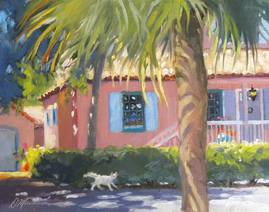
Diane Mannion, GREEN, 6x6" oil on Gessobord.

It's Not Easy Painting Green!

Created this painting to help illustrate the agony of mixing GREEN to my students!  There are natural greens found in nature... then there are the PLASTIC greens such as those found in toys, and the ghastly greens of garbage and recycling bins found in our neighborhood.  Some ready made tube greens would look perfect on a tourist's tropical shirt but screech like a nightmare in a landscape painting.  Once had to hide a tube of viridian from a student.  And I've often warned, "Beware of thalos!"  I've included a Handy-Dandy Green Tip Sheet at the bottom of this post.  Hopefully, it will help a few artists create more naturally green and environmentally pleasing landscape paintings.

Thumbnail sketch to visualize lights and darks and overall design pattern.

Sketched design on Gessobord with ultramarine blue, 
then indicated darks with mixture of red, blue, and yellow.

Blocked colors using transparent Indian yellow, alizarin crimson, and ultramarine blue.
  Decided I didn't like it.  Placed paper towel on the thick paint and pressed it off.

Finished painting again:
Worked with ultramarine blue, thalo blue, cad yellow, alizarin, and white.
Froggy was emerald green, thalo green, and cad red, cad yellow.  
Notice how the "plastic" green stands out!


Some Green Tips

A few favorite quotes:

"It's not easy being green."  -Kermit the Frog

"The secret of green is orange and violet is the friend." - Richard McKinley

"Balance greens with mauves."  -Albert Handell

*  Mix your own greens with the yellow and blue you're using in your painting to keep the colors harmonious.  

*  Tone down greens with a touch of red, rose, orange, burnt sienna, or purple.

*  Avoid darkening greens with black, use blue or red instead.

*  Black and yellow, or black and yellow ochre make a nice green.  Opposite of above tip, but depends on the painting.   This might work better for a tonalist painting (dark and light) and the above tip might work better for an impressionist style.

*  Use viridian, emerald, and thalo greens carefully!  Adjust with other colors such as the compliments.  If you want to use tube greens in landscape painting, sap green and olive green are more natural.

*  An underpainting of red, rose, orange, transparent red oxide looks fabulous under greens.  Leave specks showing here and there.

*  Get wild and silly with party colors like permanent rose for the underpainting.  Try permanent rose
with Indian yellow.  Then allow bits of this underpainting to show through foliage.  Adds lots of zip and vibrancy under greens!

*  Cerulean or thalo blue and yellow ochre for distant trees.

*  Cerulean or thalo blue and cad yellow for green grass.  

*  Thalo blue and lemon yellow for sun lit leaves... used as accents.

*  Ultramarine blue and cad yellow for vibrant green.  Darken with a touch of cad red.

*  Warm green... cad yellow and ultramarine blue.  For "Autumn" effect.

*  Cool green... cerulean or thalo blue and lemon yellow.  For "Spring" effect.

*  Tree shadows.  Introduce green's compliment... any red spectrum color.

*  Viridian and other tube greens look fine when mixed with other colors... pepper flake bits,
not huge globs.

Monday, June 3, 2013

Boca Boy

Diane Mannion, BOCA BOY, 6x6" oil

Dailypaintworks FB Pick of the Day... Yay!

 An ice cream eater squatting in the shade on a hot, hot day!

I feel a close connection to Boca Grande, Florida.  My husband and I had an art gallery upstairs in the Depot Building in the late 1990's.  There was and still is an ice cream shop downstairs in the Loose Caboose which attracts folks like bees to honey.  Many shops had signs saying No Food! but we had one that said... Ice Cream Eaters Welcome!  I'd spend the end of each day mopping sticky floors but also adding up a few extra sales.

So when this little boy appeared across the street from my booth at the Boca Grande Invitational Exhibit last weekend, I grabbed my iPhone and snapped a few grainy, long-distance reference photos.  Most of this painting is made up (to protect the innocent) but he really was wearing a funny creature hat.  There were four sets of "eyes" to consider... sunglasses on the hat, the creature's eyes, and the boy's eyes and his glasses!  The distant background and nearby bush are imagined... or as Terry Miura calls it, MSU.  Make Stuff Up.

Have been experimenting (every painting is an experiment) with wet into wet painting, or alla prima and the freezer, or frozen-alla-prima, FAP.  This little painting took two days, so to keep the paint wet I wrapped it in plastic and stuck it in the freezer where it was smashed into the back by my unsuspecting husband freezing a chunk of cheese before smoking it (for eating, not inhaling).  No damage, happy to report.  

Thumbnail Sketch where I completely redesigned the photo and added distant background.  This has become an important stage in my painting.  A way of getting into the subject, designing, noticing the value pattern, composition, and most important... what to leave out.  Dozens of problems are solved and decisions are made here before hitting the canvas!

Transparent red oxide underpainting helped me "feel" the atmosphere.  This stage also allows me to "own" or take control of the canvas, overcoming the fear of the blank "page."  I use tissues, rags, and paper towels to mold and shape the subject, almost like working with clay.  
Used only paint and Gamsol, no medium.

First color layer.  Then many more layers of thicker and
thicker paint.  Used only paint from the tubes, no medium.  Started with transparent colors then opaques.  Forgot to take more photos of the struggle.  Lots of scrapping back, rubbing out andpainting over happened.  I'd get it and lose it, get it and lose it...
 an ugly battle but happy with the results!
Thank you to all that have read and scrolled this far!  Oh, and the smoked mozzarella and lemon pizza was fabulous!  Who would have thought?!?