Saturday, April 8, 2017

Dan Thompson Workshop

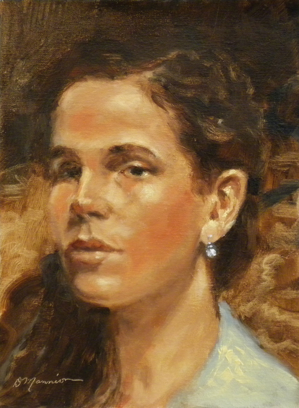
Model Study, 8x6" oil, (my first painting after workshop)©DianeMannion

Learning from a Master

Dan Thompson Workshop
Portrait Drawing
4/1-2/17
Southern Atelier, Sarasota, Florida

I try to take one or two workshops a year from artists I admire, not that I want to emulate their style, but to discover bits of knowledge that could enhance my work.  I believe artists must keep growing and learning, without this continuing education work can become static and uninspired.

It was an honor and privilege to spend last weekend learning from Dan Thompson! He’s a direct link of artistic knowledge from the late Nelson Shanks who started the Studio Incamminati in Philadelphia.  Dan entertained us with stories of Nelson Shanks while he demonstrated drawing techniques.

Soft spoken and knowledgeable, Dan’s an excellent teacher!  He has the rare capacity to draw and speak at the same time, vividly illustrating with words what he was accomplishing with pencil.  Graceful and elegant, watching him standing at the easel drawing from a live model was like watching a dance.  One hand held several pencils, kneaded eraser, and paper stump, while the other deftly drew delicate straight lines that magically gathered together into a poetic image in no time at all. 
He has an adaptable system that keeps everything loose with lots of space to move around in.  For example, instead of drawing one line to define an edge, he draws several.  Searching out shapes, he explores movements and rhythm, waves of connections with simple straight lines.  He quoted Nelson Shanks, “Curves are death,” at least at the start of a drawing.

Dan’s first stage in approaching a drawing is to react, feel the situation with a rapid response… “Let the pencil flow.”  The beginning has to be visually compelling.  It also had to be fun and filled with joy.

He said there’s an energy exchange between the sitter that doesn’t happen when working from photos.  While continuing to draw with long straight lines, a tonality builds up that connects the head with the background.  These long lines also help him look for opportunities for abstraction, patterns and design.

He keeps forms open as long as possible, rather than setting outlines this keeps the masses fluid.  He scans and plants placemarks, setting in perspective and point of view.  With his well-trained eye, he triangulates visually for measurements, comparing placemarks with background relationships.  Marking the top and bottom of the head, he keeps side measurements flexible.  He triangulated top, bottom and degree of push to sides.

He lectured on anatomical landmarks, cross-hatching for drawing techniques, structures and planes of the head.  He demonstrated the academic stance of holding a pencil at the end, rather than the way we would write, and mentioned paintbrushes should also be held the same way. 

I have pages of notes and miles of inspiration, so glad I took this workshop!  Most everything I learned can be translated into brushes.  I believe drawing is painting and painting is drawing.

Dan stressed the importance of starts!  Quoted William Merrit Chase…
 “A thing not started is a start not finished.” 
(My favorite quote of the weekend! May have to engrave this in my paintbox next to “Paint faster, Stupid.”)

Dan with model, Lee who served tea to all of us.
Dan Thompson's unfinished but brilliant demo.  
Snapshot of Dan Thompson pencil taken in gallery.  Under glass, pardon glare.
My pen sketch of Dan while he was drawing.
Another pen sketch in my Moleskine notebook.
My drawing the first day of workshop.
Second day I drew both models at once.
Kerry Vosler's wonderful drawing.  Many talented artists took this workshop!

Many of us wanted a chance to paint Lee and the Southern Atelier made a date for the following week which will be the subject of my next blog post.  We are indeed fortunate to have such an amazing and friendly place to study and learn in the company of artists and masters!

***Forgot to mention that my first painting after the workshop was also an experiment using a limited palette of Naples yellow light, ultramarine blue, and red iron oxide.  How's that for red, yellow, and blue!  The only touch of titanium white was in the earring.

Monday, April 3, 2017

Venice Rocks

Venice Rocks, 6x6" oil, plein air sketch, ©Diane Mannion

Water Study

Painted at Caspersen Beach, Venice this morning with the Peace River Painters and the Venice Plein Air group.  Artists were scattered everywhere, on the shore, under palm trees, along the boardwalk, even in parking lots.  Serious winds developed... hats blew off, easels tipped, tourists chased umbrellas down the beach! 

The calm blue Gulf turned frothy green as the bottom sand churned up. The scene I had been painting changed completely.  I was far enough along with this sketch to pick up my blown-over equipment for the second time and leave.  

So much of painting water is visual memory, nothing holds still!  Even though this scene is simply bands of sky, water, rocks and sand, I began with a thumbnail sketch.  Always useful for mapping out patterns and rhythms, a design plan of attack before hitting the canvas.  Takes away the fear of approaching the scary blank space.  

My thumbnail sketch this morning was extremely abstract and loose.  I prefer a more detailed design, a notan blocking out darks and lights, but knew the winds were coming and acted fast.
Quick thumbnail sketch in Moleskine sketchbook with black pen.


Thursday, March 30, 2017

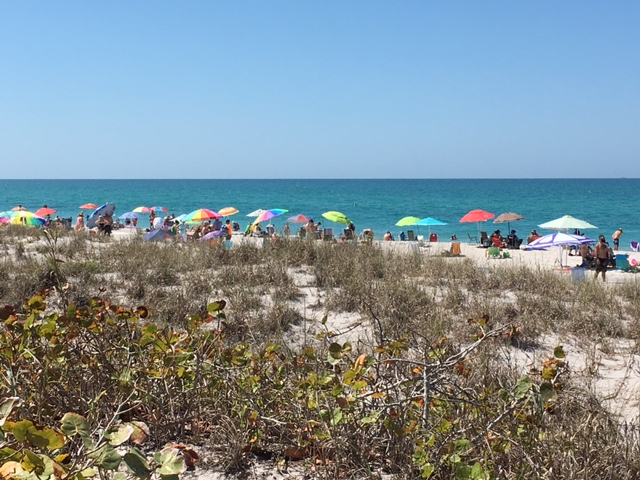
Busy Beach

Busy Beach, plein air sketch, 4x8" oil, ©Diane Mannion

Shady Studio

Don't want anyone to think I've been slacking off by not posting as often, but I'm busy with eight commissions.  And will be taking a workshop this weekend with Dan Thompson, portrait drawing, promise a full report!

So my blog contribution for today is another little sketch painted during a studio break.  Found a blissful spot on a dune by the edge of a quiet path to the beach with high real estate value… SHADE.
This large gopher turtle crawled right under my tripod.
Messy thumbnail sketch and view


Wednesday, March 29, 2017

Boca Pass

Boca Pass, 4x8" oil, ©Diane Mannion

Yesterday

Quick sketch at Boca Grande Pass yesterday near the Light House.  Have a few small linen panels I want to use up, much happier with larger sizes.  Picked a bad spot in the sun and didn't bring an umbrella.  Note to self… get out earlier!

Used an old, favorite paintbox box, 6x8" Alla Prima Pochade… a work of art!  Holds paints, short brushes, medium, and panels in one tidy space.  Love to pop it in a bag and go paint. 

And as long as I'm writing about art supplies, another favorite, my new watercolor box! 
Pocket Palette by Art-Toolkit.com, is about the size of a business card!  It has empty pans (held in with magnets) which I fill with tube watercolors of my choice.  I use a Pentel water brush (water is in the handle) and a small Moleskine sketchbook.  Small enough to carry with me always.  Perfect for stealth painting!!!
Paintbox ready to go with thumbnail sketch created with Pocket Palette and Pentel water brush.

Thumbnail sketch,  on hot press paper Moleskine

Finished sketch still on paintbox

Links to a few of my favorite things!


Sunday, March 26, 2017

JUDY

Judy and Lucy, 24x34", oil, ©Diane Mannion 2016

Commissioned Posthumous Painting

Someone just asked about this painting and I realized I had never posted it, so here it is a year later.

This was a special commission, sensitive portrait of someone's sister who had recently passed.

The project was to use the client's photograph and not make many changes.  I had suggested a window looking out to the ocean or a plant on the shelf, but this was the sister's favorite spot and was asked not to change it.

Judy's book was open in the photograph, I closed it, end of story… and put her name on the spine.  I emphasized the wet footprints of Judy and the dog which were drying and disappearing on the right side.  And did not notice until later that the white pillow behind her looked like angel wings.  

Really sad but hopefully my painting has brought comfort to the family and that this young woman is forever in her favorite spot.

Saturday, March 18, 2017

Off Port Clyde Again

Off Port Clyde Again, 18x24" oil, ©Diane Mannion

AMELIA

Recent commission based on an earlier painting.  

While sketching on a dock in Maine, I watched this jewel of a boat sail off in a brisk wind across Port Clyde Harbor.  Followed it along with my zoom lens, snapping reference photos, hoping they'd be useful for future work. 

My client requested more information about the sailboat, so I Googled it.  Typed "small sailboat Maine" in images.  Looked at several hundred!  The classic Herreshoff 12 daysailer looked quite similar.  After viewing several hundred more images, a teal colored hull popped out… EUREKA!!!

Not only had I found the type of boat, but it turned out to be the very one I had photographed that day in Maine!  AMELIA, a Paine 14, owned and built by Chuck Paine.  I immediately sent him an email and a photo.   He replied right away... "That is indeed me sailing my boat, Amelia!" 

Chuck Paine is a yacht builder and also a very fine artist!  


It's alway a good idea to keep a camera handy!  This boat would not have stayed still long enough even for a quick study.  The landscape is based on studies painted on the dock in Port Clyde.  And when I visit there again, my new friend, Chuck Paine has promised me a tour of his studio!

Many of my paintings are available at the Hughes Gallery, Boca Grande, Florida. 

Thursday, March 9, 2017

Girl with Sea Blue Hair

Girl with Sea Blue Hair, 15x17" oil, ©Diane Mannion

Rachael!

Portrait of Rachael who's almost 13!  We went to the Sarasota Jungle Gardens and both of us wore the same parrot earrings, perfect accessory for visiting those colorful birds.

This painting was a struggle because of the blue hair which was fading back to blond.  Pulled out every tube of blue and found ultramarine mixed with burnt umber came closest.

Record of my struggle:

Lots of changes!  Decided early on that the arm was needed, first pose was too stiff… that elbow added lots of character. 
(Pardon the canvas wave, it's not stretched yet, just taped to a board which I'll mount it to later). 

Monday, March 6, 2017

Windy Sunday

Windy Sunday, 9x12" oil, plein air, ©Diane Mannion

Sunday Painters

Painted with Jane Sither and Kathleen Crane near the Boca Grande Lighthouse while fierce winds kept us hunkered down.

My painting, Windy Sunday is a view on the west side looking north.  The beach has eroded about five feet down. There once was a great view of the lighthouse from this spot, now only the top shows. Steps are missing on the foreground structure...  now a perfect perch for crows.

This is how my painting looked fresh from the beach.  Above image is after polishing and tinkering in the studio.  Had painted with sunglasses the whole time, felt the painting needed more contrast, details, and people for scale.  I'm not a plein air purist (one who doesn't retouch later).  I'll do whatever it takes to make a painting work!  


Jane Sither, Me, and Kathleen Crane holding her lovely watercolor!

 My view
Wanted to add the woman reading, but will have to wait until another painting!
 Jane and her wonderful lighthouse!
At times, the sky was speckled with tiny birds we thought might be swallows.

Monday, February 27, 2017

No Swimming!

No Swimming! 9x12" oil, plein air, Diane Mannion

Boca Grande Lighthouse
2/27/17

Fabulous morning painting with the Peace River Painters!  Fresh breeze kept red tide offshore, artists dotted the beach (actually more artists than tourists!).  Sailboats scampered out the pass on choppy seas at the perfect time to be painted in!

I picked this view because I loved the No Swimming flag, a slash of bright red surrounded by dark green.  And the limited view of the lighthouse made for easier architectural rendering ( those front porch railings gave me lots of headaches on previous paintings).  

Used Tombow N15 and N55 markers for my thumbnail sketch in my Moleskin sketchbook because it doesn't bleed through the pages as much as the Copic markers did.  (Image on left is two minute pose from figure drawing session.)  This sketch showed I had to make lighthouse smaller. It's not pretty... simply visual notes and thinking on paper.  I like to make mistakes in these thumbnails rather on the canvas.  

My blissful view while painting on location.

A few artists during the gentle crit led by Sharon Yarbrough.  We learn a lot from each other!
Our group is open and free, and as Sharon said, "It's an AAA meeting for Artists Addicted to Art!"

Monday, February 20, 2017

LUNA'S!

LUNA'S, 8x10" oil, ©Diane Mannion

SRQ and Venice Plein Air Painters!

Wonderful morning painting with many talented artists in Venice, Florida.  Rain was expected but held off long enough to capture sunlight and shadows on this popular restaurant.  Took my mom there for lunch once and it was really excellent.

Painted LUNA'S! with many fun interruptions from tourists and other artists.  Sometimes, paintings come out better when I let them paint themselves like this one.  Happy with it!

Here I am with Durinda Cheek, a selfie with Mary Erickson, Johan Bjurman, Tony D'Amico, and Maryanne Jacobsen!

Wednesday, February 8, 2017

Snook Nook

 Snook Nook, 8x10" oil, ©Diane Mannion

Before and After

Always a treat painting with friends!  Peace River Painters met in Boca Grande Monday, but I spent more time talking than painting… and a quick trip through the Bargain House didn't help either.

The image on the left is what I went home with.  Spent this morning fiddling, was either a wipeout or a good excuse to push paint.  Could work on these things forever, when is it really finished?  But I like some of the results, especially the light flecks showing through the fence.

The Snook Nook was built in 1910 and remains one of the most charming cottages on the island.
A little white dog sat in the doorway watching all the action.  A wonderful pink, fat-tire bike sat out front until someone rode off on it.  Folks walked by, joggers, dog walkers, a woman pushing a baby carriage.  Plenty of tourists stopped to peak as artists worked behind easels…  Wish I could have painted everything!  

Sunday, February 5, 2017

Surf Sunnies

Surf Sunnies, 8x10" oil, ©Diane Mannion

Sunflowers #3

These sunflower paintings are actually small studies for a large project, working out compositions and color.  

Wanted to keep the background subdued in #3 so the flowers would pop.  Happy that the sky, water, and sand are completely from my visual memory bank.

Tried to keep the yellow and orange colors clean in the underpainting.

Painted background next.

Because this was painted wet into wet, or alla prima… it was difficult keeping yellows clean.
Wiped my brush after almost every stroke!

Saturday, February 4, 2017

Sunflowers #2

Sunflowers #2, 8x10" oil, ©Diane Mannion

Sunflowers!

Still another sunflower painting and there will be more…  

Trip down memory lane: Came across some old photos from the 1990's when I painted a lot of flowers! 
 The top painting (almost 10 feet wide) with the yellow flower is a view from a clients home of the lighthouse in Boca Grande.  Bottom is me in my studio on Old Englewood Road.
Interior shot of our gallery upstairs in the Depot Building, Boca Grande.  John's furniture and fish which he designs, builds, and paints.

Friday, February 3, 2017

Sunflowers

SUNFLOWERS, 8x10" oil, ©Diane Mannion

Yellow!

Sunflowers were suggested by a friend so I've started a mini-sunflower series because they're a delightful subject… except for yellow.  I find yellow the most challenging color!

While making piles of paint in three different values on my palette to start with, light and medium values were easy.  I had every tube of yellow out to compare.  Dark yellow, especially a cool dark yellow, like the bottom right flower in the shade was a struggle.  

Piles of mud appeared, too much blue made green, earth tones made brown.  Painted and scraped, blotted with paper towels and started again.  TIP!  If too much paint piles on simply blot it off with a paper towel… see image below.

A dab of purple toned the yellow down.  A touch of naples yellow light raised the value of the "lighter" petals in the shade.  Yellow simply had to be judged by seeing how the color appeared to the color right next to it.  It could look yellow on the palette but when placed next to another yellow on the painting it might look green.  

Here's the painting progression from sketch to block-in stage.  Thought the left side needed something else so I added the amber jar and purple flowers.


Blotting tip… place smooth side of paper towel on top of painting and rub.  Pulls off excess paint so the canvas can be "repainted."  I use the workshop towels that are found in the auto department at Walmart or Home Depot.  Nice blue color, too!